High performance computing produces various data. The step between reading this data and creating human-readable insights is called “Post processing”. Obtained HPC Results often overshadow the activity of post-processing. This text unveils the efforts people invest is this thankless job.

Readers of HPC communications only see the few post-processing that worked out. The actual job is not that straightforward. (Photo DeepLMind on Unsplash)
“That’s Phd-stuff!”. In my humble past and present experience, I heard several times academical people nicknaming the act of post-processing as “Phd-stuff”. The menial work of crunching myriads of binary files with unfathomable names to draw figures supporting the point of a publication, is however substantial.
While post-processings steps are, for most of them, on-the-shelf and well documented, nobody talk about what happens between the shelves and the workbench. How someone patches these totally unrelated parts together to make an actual analysis?
Analysis of a particle field: “Did the droplet crossed the plane?”
For this tutorial, our example comes from Computational Fluid Dynamics. Droplets of Heptane fuel are moving in an air flow. At a given plane in space, some device records each droplet crossing the plane : its position, velocity, diameter, temperature, etc…. We start from the output of this device, a binary file called solut_ptcl_C7H16_particles_stats.h5.
The following examples are written in Python, the most popular langage for this task in 2023 , to the authors knowledge.
Unboxing the data
The suffix .h5 is characteristic of the HDF5 format. A short search on the web to see how to read this in Python yields many trustworthy-looking tutorials with the library h5py.
Let’s look inside :
import h5py
with h5py.File("./OUTPUTS_MINING/z_4_mm/solut_ptcl_C7H16_particles_stats.h5", "r") as h5pf:
    print(h5pf.keys())
<KeysViewHDF5 ['z_4_mm']>
Ok, there is one single group 'z_4_mm' of data at the root of the file. Rummaging further, we get :
import h5py
with h5py.File("./OUTPUTS_MINING/z_4_mm/solut_ptcl_C7H16_particles_stats.h5", "r") as h5pf:
    print(h5pf.keys())
    print(h5pf['z_4_mm'].keys())
    my_x = h5pf['z_4_mm/x_ptcl'][()]
    print(my_x)
python tmp.py
<KeysViewHDF5 ['z_4_mm']>
<KeysViewHDF5 ['Injection_time', 'cross_time', 'crossed_particles', 'd1_ptcl', 'd2_ptcl', 'd3_ptcl', 'id_injector', 'ptcl_type', 'radius_ptcl', 'rparcel_ptcl', 'temperature_ptcl', 'u_ptcl', 'v_ptcl', 'volume_ptcl', 'w_ptcl', 'x_ptcl', 'y_ptcl', 'z_ptcl']>
[ 0.01023857 -0.00696573 -0.0049464  ... -0.00502746 -0.00099363
 -0.00058747]
Good news. The third party library called h5py is apparently giving us access to the data. Let’s wrap this up into a fonction:
def load_ptcl_file(
        fname:str,
        pname:str,var:str,
        max_population: int=1000.
    )->Tuple[np.array,np.array,np.array,np.array]:
    """Get file content from ptcl file FNAME.
    As the root group changes with file, it is given as PNAME
    If there are too many particles, the dataset is undersampled to MAX_POPULATION
    """
    with h5py.File(fname, "r") as h5pf:
        my_x = h5pf[pname+'/x_ptcl'][()]
        my_y = h5pf[pname+'/y_ptcl'][()]
        my_z = h5pf[pname+'/z_ptcl'][()]
        print("Z Mean / std. :", my_z.mean(),my_z.std())
        ponderation =  h5pf[pname+'/volume_ptcl'][()]
        source =h5pf[pname+'/'+var][()]

    skip = max(1,round(my_x.size/max_population))
    if skip > 1:
        print(f"Warning, found {my_x.size} particles, bigger than limit {max_population}. Skipping evey {skip} point.")

    return (
        my_x.ravel()[::skip],
        my_y.ravel()[::skip],
        ponderation.ravel()[::skip],
        source.ravel()[::skip]
    )
To improve the readability and clarify the use of the function, this code uses typing (all inputs and outputs have an explicit type) and a docstring (the text between the """). It also features a subsampling parameter max_population to cut down the execution time while we develop.
Note the [()] notation : this kabbalistic notation means that the content of the dataset is returned as a “numpy array”. Numpy, like h5py, is a third library dedicated to fast computations on full arrays instead of scalars : e.g. if A and B are both (234x789x56) 3-D matrices, the element-wise product is simply written as A*B.
We call the function this way:
varname = "temperature_ptcl"
varname =  "w_ptcl"
pname= "z_10_mm"
ptclstat = f"./OUTPUTS_MINING/{pname}/solut_ptcl_C7H16_particles_stats.h5"
my_x,my_y,ponderation,my_var = load_ptcl_file(
    "/OUTPUTS_MINING/z_10_mm/solut_ptcl_C7H16_particles_stats.h5",
    "z_10_mm",
    varname,
    max_population=10000
)
You might wonder why I printed the Z values average and deviation?
Z Mean / std. : 0.10600000000000033 3.465126531066907e-16
Well, the running gag of post processing is to think your data was recorded here, but too bad for you, it was there. Here the plane is named “Z 10mm” but the actual coordinate in the dataset is z=106mm.
Vizualize the raw data
It is good practice to look at the raw data without specific treatment first. We will use the popular graphical library matplotlib r this purpose:
def show_scatter(my_x,my_y,diameter,temperature):
    """Scatter plot of the particles"""
    plt.scatter(
        my_x,
        my_y,
        10.*diameter/diameter.max(),
        temperature,
        )
    plt.title("Particles \n Size: diameter, Color: temperature")
    plt.colorbar()
    plt.xlabel("X [m]")
    plt.ylabel("Y [m]")
    plt.gca().set_aspect('equal', 'box')
    plt.show()
Note the operation 10.*diameter/diameter.max() applied to the whole diameter field, not a single particle, thanks to the simplified numpy algebra.
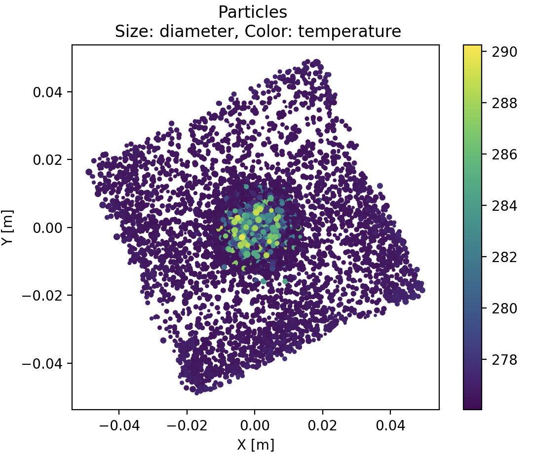
With this simple plot, we already get that :
- big hot particles are clustered at the center.
- acquisition plane is unexpectedly tilted, roughly 30 degrees anticlockwise, with respect to X and Y axis.
- there are also more particles at the corners of the plane
Drawing the heatmap
Scatterplot are however poorly representatives of the actual density of points, because a thousand markers at the same position looks like one single marker. Adding transparency to the markers (alpha=0.1) mitigates this superimposition effect, but we can be quantitative with a Heatmap. We define a spatial grid, then count the particle number enclosed in each grid cell. Here is a solution using matplotlib.pyplot‘s Hexagonal Binning.
def show_spatial_heatmap(
        x_coor:np.array,
        y_coor:np.array):
    """Display a spatial heat map on the samples"""
    lwrx = min(0., x_coor.min())
    lwry = min(0., y_coor.min())
    hghx = max(0., x_coor.max())
    hghy = max(0., y_coor.max())
    plt.hexbin(x_coor, y_coor,cmap='GnBu')
    plt.plot(
        [lwrx,hghx],
        [0.,0.],
        color="black"
        )
    plt.plot(
        [0.,0.],
        [lwry,hghy],
        color="black"
        )
    plt.title(f"Spatial repartition of {x_coor.size} particles")
    plt.colorbar()
    plt.xlabel("X [m] (local frame)")
    plt.ylabel("Y [m] (local frame) ")
    plt.show()
We added here two black crosshairs to check that the cluster of particles is well centered with these coordinates. Indeed, if the data is off-center, any radial analysis would be silently jammed.
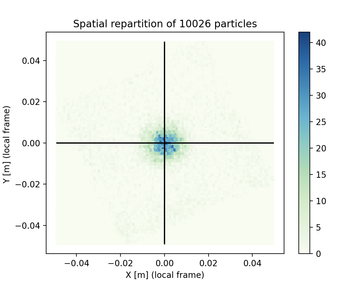
This plot shows that droplet density varies a lot spatially. This is especially bad news for statistics : the confidence of each information might vary a lot.
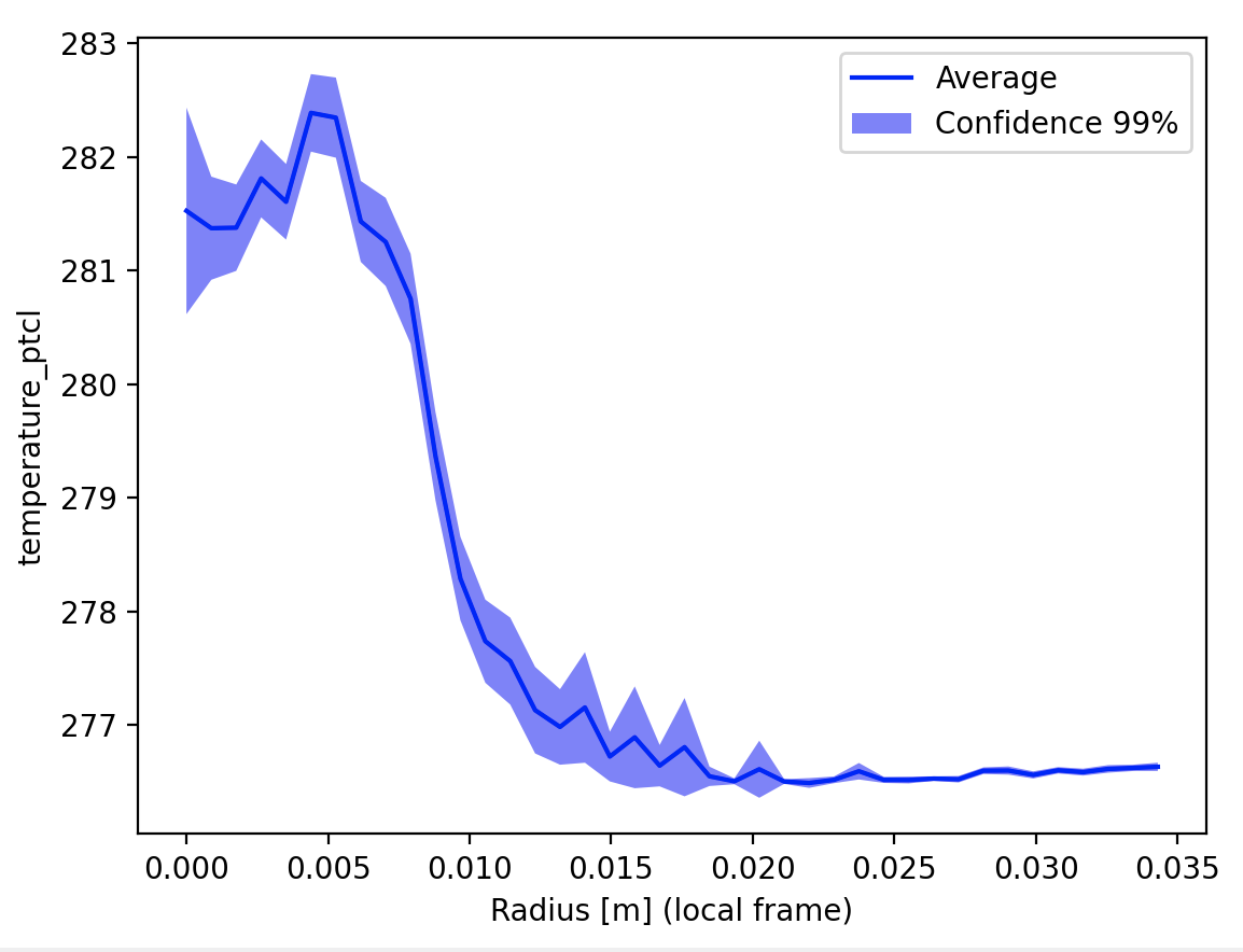
Drawing a profile
Lets chart the temperature profile now. The principle is to :
- manually bin data to a radial vector
- compute a weighted average and standard deviation from each bin
- calculate the confidence we have in each position
The weighted average and standard deviation weighted_avg_and_std() is not trivial because our good-old averaging is now weighted and applied only to a portion of the data. In the present case the weight is proportional to volume : the larger a droplet , the larger its contribution to the statistics.
The mask array is simply a boolean flag saying “yes, this value must be taken into account / No, this value must not be taken into account”. For example, one can create a mask according to the information time: all particles that crossed the plane before 0.31 sec must not be taken into account. This would control the time-range of the processing.
def weighted_avg_and_std(
        values:np.array,
        weights:np.array,
        mask:np.array=None)->Tuple[np.array,np.array]:
    """
    Returns the weighted average and standard deviation.
    If a MASK array is provided, quantities are evaluated only on non-masked data

    values, weights -- Numpy ndarrays with the same shape.
    """
    if mask is None:
        average = np.average(values, weights=weights)
        # Fast and numerically precise:
        variance = np.average((values-average)**2, weights=weights)
        return (average, np.sqrt(variance))

    # Masked version
    if mask.sum() == 0:
        return 0.,0.

    average = np.average(values[mask], weights=weights[mask])
    # Fast and numerically precise:
    variance = np.average((values[mask]-average)**2, weights=weights[mask])
    return average, np.sqrt(variance)
The formula for confidence interval is well explain in this Medium post “The Normal Distribution, Confidence Intervals, and Their Deceptive Simplicity”. The Z-score for the confidence is computed thanks to the scientific computing package scipy which provides advanced statistical tools. First we select one of the many distributions available with :
from scipy.stats import norm as dist # Normal distribution
Then we ask for the Z-score with dist.ppf(confidence).
Finally we have our main radial profile function looking like:
def build_radial_bins(
        my_x:np.array,
        my_y:np.array,
        rad:float,
        ponderation:np.array,
        my_var:np.array,
        bins:int=30,
        confidence:float=0.99
    )-> Tuple[np.array,np.array,np.array]:
    """Build a vector of weigthed averages, sum of samples, and confidence interval,
    in the radial frame from O to RAD.

    NB : All input arrays have the same shape.

    Ref: https://medium.com/swlh/a-simple-refresher-on-confidence-intervals-1e29a8580697 concerning the confidence intervals. TODO: find a more academical source.

    Returns:
        weighted average , shape (bins,bins)
        sum of samples , shape (bins,bins)
        confidence interval , shape (bins,bins)

    """

    out_avg=np.empty((bins,))
    out_std=np.empty((bins,))
    out_sum=np.empty((bins,))
    out_error=np.empty((bins,))
    my_r = np.hypot(my_x,my_y)
    for i in range(bins):
        r1=rad*i/(bins-1)
        r2=rad*(i+1)/(bins-1)
        mask = (my_r>r1)*(my_r<=r2)
        if np.sum(mask)>0:
            out_avg[i], out_std[i] = weighted_avg_and_std(
                my_var,
                weights=ponderation,
                mask=mask)

            out_sum[i] = np.sum(mask)

            out_error[i]= (
                out_std[i]
                * dist.ppf(confidence)
                / (np.sqrt(out_sum[i]))
            )
    return out_avg,out_sum,out_error
With this we get the radial profile with confidence interval. This function could be improved with an automatic fit of the observed distribution, but this is an other story.
Let’s plot the result:
def show_radial_plot(
        rad_avg:np.array,
        rad_error:np.array,
        rad:float,
        confidence:float,
        bins:int,
        linecolor:str="blue",
        title:str=""):
    """Display the radial profile"""

    r_axis = np.linspace(0,rad,bins)

    confidence = int(confidence*100)
    plt.plot(r_axis,rad_avg,color=linecolor, label="Average" )
    plt.fill_between(
        r_axis,
        (rad_avg-rad_error),
        (rad_avg+rad_error),
        alpha=0.5,
        facecolor=linecolor,
        label=f"Confidence {confidence}%")
    plt.legend()
    plt.xlabel("Radius [m] (local frame)")
    plt.ylabel(title)
    plt.show()
It is important to state on the plot the confidence used, because the data trend depends heavily from it.
Once more, In two dimensions
We can do the exact same thing as a cartesian map instead of radial profile. Same function with an outer loop:
def build_grid_bins(
        my_x:np.array,
        my_y:np.array,
        rad:float,
        ponderation:np.array,
        my_var:np.array,
        bins:int=30,
        confidence:float=0.99
    )-> Tuple[np.array,np.array,np.array]:
    """Build a matrix of weigthed averages, sum of samples, and confidence interval
    in the cartesian frame from [-RAD RAD] in x and y-direction.
    NB : All input arrays have the same shape.

    Returns:
        weighted average , shape (bins,bins)
        sum of samples , shape (bins,bins)
        confidence interval , shape (bins,bins)

    """

    out_avg=np.empty((bins,bins))
    out_std=np.empty((bins,bins))
    out_sum=np.empty((bins,bins))
    out_error=np.empty((bins,bins))

    for i in range(bins):
        x1=-rad + 2*rad*i/(bins-1)
        x2=-rad + 2*rad*(i+1)/(bins-1)
        for j in range(bins):
            y1=-rad + 2*rad*j/(bins-1)
            y2=-rad + 2*rad*(j+1)/(bins-1)

            mask =  (my_x>x1)*(my_x<=x2)*(my_y>y1)*(my_y<=y2)
            if np.sum(mask)>0:
                out_avg[i,j], out_std[i,j] = weighted_avg_and_std(
                    my_var,
                    weights=ponderation,
                    mask=mask)

                out_sum[i,j] = np.sum(mask)

                out_error[i,j]= (
                    out_std[i,j]
                    * norm.ppf(confidence)
                    / (np.sqrt(out_sum[i,j]))
                )
    return out_avg,out_sum,out_error
Showing the result in matplotlib is a bit trickier, especially to have spatially meaningful axes:
def show_grid_plot(
        grid_avg:np.array,
        grid_error:np.array,
        rad:float,
        confidence:float,
        bins:int,
        title:str=""):
    """Display a spatial heat map on the samples"""

    #xy_axis = [ f"{val:0.2g}" for val in  np.linspace(-rad,rad,bins)]
    xy_axis =  np.linspace(-rad,rad,bins)
    label_format = '{:,.2f}'

    fig, (ax1, ax2) = plt.subplots(1, 2)
    im = ax1.imshow(grid_avg, cmap='GnBu')

    fig.colorbar(im,  orientation='vertical')
    ax1.set_xlabel("X [m] (local frame)")
    ax1.set_ylabel("Y [m] (local frame)")
    ax1.set_title(f"Average on {title}")


    confidence = int(confidence*100)

    im2 = ax2.imshow(grid_error, cmap='YlOrBr')
    fig.colorbar(im2,  orientation='vertical')
    ax2.set_xlabel("X [m] (local frame)")
    ax2.set_ylabel("Y [m] (local frame)")
    ax2.set_title(f"Confidence interval {confidence}%")


    # Replace XY labels by actual position
    ticks_loc = ax1.get_xticks().tolist()
    xy_axis=np.linspace(-rad,rad,len(ticks_loc))
    xy_labels=[label_format.format(x) for x in xy_axis]

    ax1.xaxis.set_major_locator(mticker.FixedLocator(ticks_loc))
    ax1.set_xticklabels(xy_labels)
    ax1.yaxis.set_major_locator(mticker.FixedLocator(ticks_loc))
    ax1.set_yticklabels(xy_labels)
    ax2.xaxis.set_major_locator(mticker.FixedLocator(ticks_loc))
    ax2.set_xticklabels(xy_labels)
    ax2.yaxis.set_major_locator(mticker.FixedLocator(ticks_loc))
    ax2.set_yticklabels(xy_labels)
    plt.show()
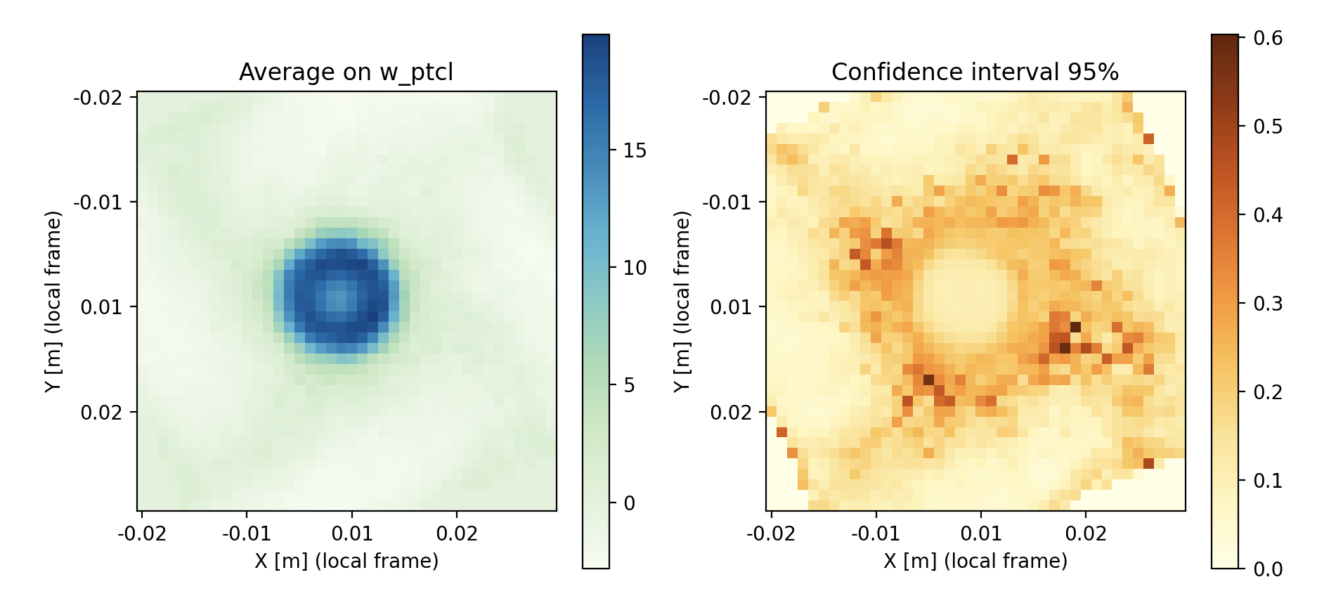
In this image, done for the velocity this time, we see that the low confidence locations are limited to intermediate radii. Good confidence is a combination of low standard deviation and high number of samples. Finding a peak uncertainty in this region is to be expected : center region is loaded with particles, and outer region is very calm.
Oooof, that was heavy on the axes tuning. Lets call it a day.
Take away
We used here several third-party packages: h5py to load the HDF5 data, numpy for matrix-like computations, scipy for statistical elements, and matplotlib.pyplot for graphics.
The latter features advanced more-than-just-a-graph functions, like the hexagonal binning hexbin().
Even if we did relatively simple visuals using these pre-built tools, the amount of code created to stitch these pieces together is nothing to be laughed : 300 lines, count 6 hours of honest re-usable work.
Here are the small hints you can keep in mind.
- Search thoroughly pre-build building blocks for your post processing. If your idea is good, someone else probably have done it in a smarter way.
- Work on a subset of the data to increase the time-to-solution cycle of your development.
- Beware of the usual flaws of the business : wrong scaling of the geometry, shift in the coordinate frames, etc… Check twice, then re-check and ask a friend.
- Cut your devs into single-purpose small functions (<50 loc). It will be easier to understand and to move around (And this can be re-used in a Notebook BTW).
- Make the extra effort of cleaning your script with a bit of documentation and typing, the you in 4 monthes will be eternally grateful.