Plot 1D bases
Description
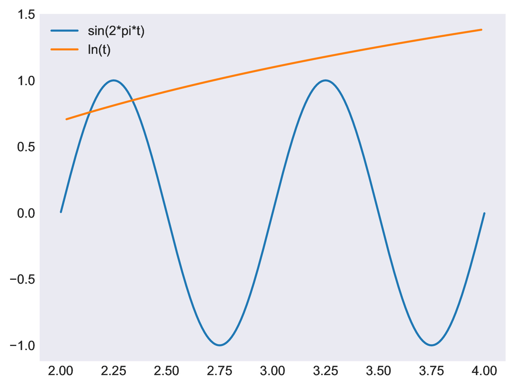
This treatment plot the 1D variables in one or several bases.
Parameters
- bases: list(
Base) The list of bases containing the variables to be plotted
- bases: list(
- x_var: str
The name of the variable to be plotted in the x axis
- y_vars: list(str), default=
[] The name of the variables to be plotted in the y axis
- y_vars: list(str), default=
- units: dict, default=
{} A dictionary from variable names to their corresponding physical units. This dictionary is used to annotate plot labels and titles using
'{unit}'. For example:{'u': 'm/s', 'rho': 'kg/m3', 'T': 'K'}
If a variable is not present in this dictionary, no unit will be shown for it.
- units: dict, default=
- units_format: str, default=
'[{unit}]' A string format that defines how units should be displayed when using {unit} format in title, and labels. The {unit} placeholder will be replaced with the actual unit string from the units dictionary.
- For example:
If units_format = “[{unit}]” and ‘u’ has unit ‘m/s’, the label becomes “u [m/s]”.
If units_format = “({unit})”, the label becomes “u (m/s)”.
If a variable has no unit defined in the units dictionary, no unit string is appended, and the format is not applied (i.e., no trailing brackets or parentheses).
- units_format: str, default=
- location: str, default=
"node" The location of the variables to be plotted
- location: str, default=
- pretty_vars: dict(str, str), default=
{} A dictionary containing a “prettier” name for the variables (see formatted strings section)
- pretty_vars: dict(str, str), default=
- pretty_instants: dict(str, str), default=
{} A dictionary containing a “prettier” name for the instant (see formatted strings section)
- pretty_instants: dict(str, str), default=
- pretty_zones: dict(str, str), default=
{} A dictionary containing a “prettier” name for the zones (see formatted strings section)
- pretty_zones: dict(str, str), default=
- overlap_zones: bool, default=
False If True, all zones will be plotted in the same figure
- overlap_zones: bool, default=
- overlap_instants: bool, default=
False If True, all instants within a zone will be plotted in the same figure
- overlap_instants: bool, default=
- overlap_vars: bool, default=
False If True, all the variables in the same instant will be plotted in the same figure
- overlap_vars: bool, default=
- x_label: str, default=
"{var}" The string to be formatted to generate the label in the x axis (see the formatted strings section)
- x_label: str, default=
- xticks_kwargs: Dict, default=
{} The extra arguments to be passed to matplotlib.pyplot.xticks
- xticks_kwargs: Dict, default=
- yticks_kwargs: Dict, default=
{} The extra arguments to be passed to matplotlib.pyplot.yticks
- yticks_kwargs: Dict, default=
- y_label: str, default=
"" The string to be formatted to generate the label in the y axis (see the formatted strings section)
- y_label: str, default=
- label_kwargs: dict, default=
{} The extra arguments to be passed to matplotlib.pyplot.xlabel and matplotlib.pyplot.ylabel functions
- label_kwargs: dict, default=
- xlim: List(float), default =
[] Define the x axis limits for all plots.
- xlim: List(float), default =
- ylim List(float), default=
[] Define the y axis limits for all plots.
- ylim List(float), default=
- x_range: List(float) or slice, default =
None Define the x range of all plots. If it’s a list, it should be a list of 2 numbers defining the minimum and maximum values on the x axis. If the first value of the list is None, start from the earliest value. If the last value of the list is None, go up to the last value.
If x_range is a slice, it defines how the arrays should be sliced.
The difference between x_range and xlim is that xlim sets the limits for the plotted axis, while x_range sets the limits for the plotted data.
- x_range: List(float) or slice, default =
- x_log: bool, default=
False Trueif the x axis should be in logarithmic scale
- x_log: bool, default=
- y_log: bool, default=
False Trueif the y axis should be in logarithmic scale
- y_log: bool, default=
- legend_label: str, default=
"{var}" The string to be formatted to generate the label in the legend (see the formatted strings section)
- legend_label: str, default=
- legend_loc: str, default=
"best" The string with the location of the legend (see matplotlib documentation)
- legend_loc: str, default=
- legend_kwargs: dict, default=
{} The extra arguments to be passed to matplotlib.pyplot.legend function
- legend_kwargs: dict, default=
- title: str, default=
"{var}" The string to be formatted to generate the of the plot (see the formatted strings section)
- title: str, default=
- title_kwargs, default=
{} The extra arguments to be passed to matplotlib.pyplot.title
- title_kwargs, default=
- figure_kwargs: dict default=
{} The extra arguments to be passed to matplotlib.pyplot.figure() function. This can be used to control the figure size and resolution
- figure_kwargs: dict default=
- axis_size: List(float), default:
[] The width and height of the plot in inches
- axis_size: List(float), default:
- grid: dict default=
None The arguments to be passed to matplotlib.pyplot.grid() function. If
None, the grid wont be displayed. If{}the grid will be displayed with the default matplotlib parameters
- grid: dict default=
- plot_style: str, default=
"default" The matplotlib style to be used in the plot.
- plot_style: str, default=
- latex_font: bool, default=
False If
Trueuse the latex default font for the text in the figure.
- latex_font: bool, default=
- show: bool, default=
True Show the plots using the matplotlib GUI.
- show: bool, default=
- output_file: str, default=
None The filename used to save the figures. If
None, the figures are not saved. This can be a formatted string to create multiple figures (see the formatted strings section)
- output_file: str, default=
- save_bbox: str or list(float), default=
'tight' The size of the figure bounding box in inches. If
tight, the saved figure will not have any extra white space around it
- save_bbox: str or list(float), default=
Preconditions
The variable x_var must exist in each base/zone/instant of the input bases
Postconditions
If output_file is not None, the figures are saved in the
files output_file
Formatted strings
The figure titles, labels, and the output filename are all strings that could vary from plot to plot depending on the base, zone, instant and/or variable being plotted. They are controlled by the keywords: xlabel, ylabel, title, legend_label and output_file.
In order set the correct string for each plot, formatted strings (or f-string) are used inside the treatment. The key/values of these strings are:
“{var}”: name of the current variable being plotted.
“{pretty_var}”: prettier name for the current variable being plotted (defined by ‘pretty_vars’ keyword)
“{instant}”: name of the current instant being plotted.
“{pretty_instant}”: prettier name for the current instant being plotted (defined by ‘pretty_instants’ keyword)
“{zone}”: name of the current zone being plotted.
“{pretty_zone}”: prettier name for the current zone being plotted (defined by ‘pretty_zones’ keyword)
“{base_name}”: name of the current base, specified in the base level attribute “base_name”.
“{unit}”: the unit of the current variable in format “[unit]”
For legend_label all these keywords are available at all times.
However, for all other keywords (ylabel, title, and
output_file), the availability of these depends on the
overlap_vars, overlap_zones, and overlap_instants
keywords. Those set to True will not be available. For
example, if overlap_zones = True, the string “{zone}”
cannot be set in title, because there are multiple zones being
plotted in the same figure, so the “{zone}” value is ambiguous.
Finally, for x_label, the keyword “{var}” is always available as there is only one variable assigned to the x axis.
Note that the input strings of these keywords do not contain the leading “f” character of f-strings. They must be plain strings and it is the treatment itself that formats them.
Plot kwargs
The individual aesthetics of how each dataset is plotted can be controlled by the attributes “plot_kwargs” or “plot_kwargs_variable_name”. This attribute must be a dictionary whose keys are the keyword arguments of the function matplotlib.pyplot.plot. This can be used to change the line style, marker styles, color, etc. of each dataset.
A single “plot_kwargs” attribute can be defined at the instant, zone or base level for all variables in the instant, zone or base. And for a more fine-grained control, attributes of with the name “plot_kwargs_variable_name” can be defined to set the aesthetics of individual variables.
Example
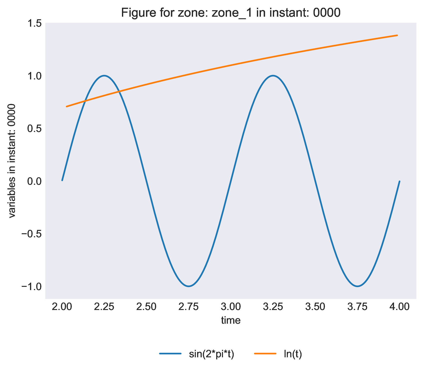
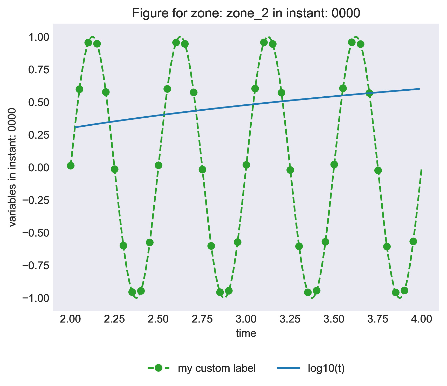
The following example shows how to compare 2 bases
"""
This example illustrates how to use the Plot1d treatment
"""
import os
import antares
import numpy as np

output_folder = os.path.join("OUTPUT", "TreatmentPlot1D")
os.makedirs(output_folder, exist_ok=True)

# ------------------------------
# Create example bases with data
# ------------------------------

# This first base contains 2 zones with two variable each:
# - zone_1: time and sin(2 pi t)
# - zone_2: time and sin(4 pi t)

base_sin = antares.Base()
base_sin.attrs['base_name'] = 'sinus function'
base_sin['zone_1'] = antares.Zone()
base_sin['zone_1']['0000'] = antares.Instant()
base_sin['zone_1']['0000']['time'] = np.linspace(0, 5, 2000)
base_sin['zone_1']['0000']['sin(2*pi*t)'] = np.sin(2*np.pi * base_sin['zone_1']['0000']['time'])

base_sin['zone_2'] = antares.Zone()
base_sin['zone_2']['0000'] = antares.Instant()
base_sin['zone_2']['0000']['time'] = np.linspace(0, 5, 2000)
base_sin['zone_2']['0000']['sin(4*pi*t)'] = np.sin(2 * 2*np.pi * base_sin['zone_2']['0000']['time'])

# Define custom plotting attributes for one variable
base_sin['zone_2']['0000'].attrs['plot_kwargs_sin(4*pi*t)'] = {
    'marker': 'o',
    'markevery': 20,
    'linestyle': '--',
    'color': 'tab:green',
    'label': 'my custom label',
    }


# This first base contains 2 zones with two variable each:
# - zone_1: time and ln(time)
# - zone_2: time and log10(time)

base_log = antares.Base()
base_log.attrs['base_name'] = 'log functions'
base_log['zone_1'] = antares.Zone()
base_log['zone_1']['0000'] = antares.Instant()
base_log['zone_1']['0000']['time'] = np.linspace(0.5, 10, 200)
base_log['zone_1']['0000']['ln(t)'] = np.log(base_log['zone_1']['0000']['time'])

base_log['zone_2'] = antares.Zone()
base_log['zone_2']['0000'] = antares.Instant()
base_log['zone_2']['0000']['time'] = np.linspace(0.5, 10, 200)
base_log['zone_2']['0000']['log10(t)'] = np.log10(base_log['zone_2']['0000']['time'])


# ----------
# Plot data
# ----------

antares.treatment.Plot1D(
    bases = [base_sin, base_log],
    x_var = 'time',
    overlap_vars = True,
    x_label = '{var}',
    y_label = 'variables in instant: {instant}',
    x_range = [2, 4],
    title = 'Figure for zone: {zone} in instant: {instant}',
    legend_label = '{var}',
    legend_loc = 'upper center',
    legend_kwargs = {'bbox_to_anchor' : (0.5, -0.15), 'ncols': 2},
    output_file = os.path.join(output_folder, 'figure_for_zone_{zone}_and_instant_{instant}.pdf'),
    plot_style = 'seaborn-dark',
    show = False,
    figure_kwargs = {'figsize': (10, 5), 'dpi': 600},
)